Does Loss Data Mask Useful Information?
- Richard Dixon

- Nov 23, 2020
- 5 min read
Something's been bugging me recently and it's changing the way I think about loss data. Let me at least attempt to try and explain why and then you can all contact me and tell me I'm mad.
1) A Simple Example
Let's think about a simple landfall of a wind hazard. It could be windstorm, it could be hurricane. As the system approaches a coastline, it's heading towards insurance (or economic) exposure. Where the storm makes landfall is fairly certain on a regional basis, but the exact landfall is usually fairly uncertain: look at the cone of uncertainty as a storm approaches land and it's only in those last 12-24 hours that we get some more certainty around the landfall.
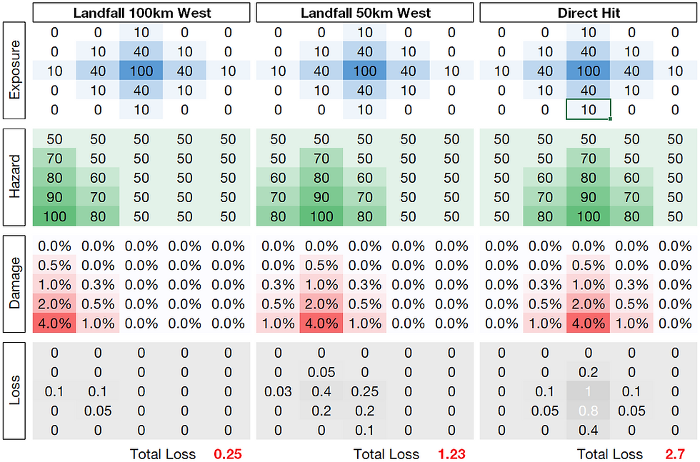
Take the example below: it's a very simple example of a hurricane landfall. We can assume if you like that the hazard here is peak gust. We've plotted out the hazard, used a simple vulnerability to apply to the exposure to get a loss. The exposure is picked to show a city that is slightly inland from the coast, say, the example of Houston. All I've done here is move the hazard further and further away from the city. If we assume the scale of each cell here is - in keeping with the Houston picture - about 50km, we're really not moving the storm much.

The hazard in the footprint itself stays the same, the vulnerability the same, the exposure the same, but as the location shifts, the wind loss shifts from 2.7 to 1.23 to 0.25 - a greater-than-tenfold change in resultant loss: and this is for a 100 mph storm: for the Cat 4s and 5s with the huge hazard gradients this change in loss can be much larger.
In this example, the storm has a range of 0.25 - 2.7 loss units, for what essentially is a potentially damaging storm. We could define the storm instead by its total damage potential: and this wouldn't change, irrespective of landfall location. In this sense, "loss" as a metric really isn't that useful to understand trends in the strength of systems that are hitting land.
The simple point I'm trying to demonstrate here is that more and more I'm starting to see exposure as a random nuisance (!) in trying to understand what might be happening in and around us at the moment, or to put it rather crudely:
Loss = Hazard * Vulnerability * Random Layer of Noise
Why should we be trying to use loss data to understand trends in risk when there is a random layer of noise impregnated in the data?
Of course we can look at loss trends over time and factor these up to today's insurance values - but as much as they are what we write business against, the actually losses per event are affected by the vagaries of where the chaotic atmosphere might send the storm.
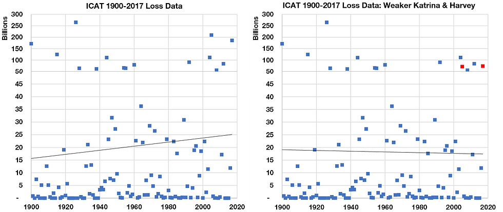
We can demonstrate the capricious nature of losses and trends by simply by looking at the ICAT loss data and making some simple adjustments to historical storms.
Let's imagine for the sake of it that
1) Katrina (2005) hit further from New Orleans and gave, say, $10bn in losses
2) Harvey (2017) gave, maybe $20bn of losses as it moved further east of Houston.
Two subtle adjustments to these big storms and - hey presto - your upward trend in the ICAT data is now downward.

I'm not using this example to trash the data, I'm using this as an example to say:
Exposure makes our results very sensitive if we want to try and understand trends".
Which leads me to.....
2) Why Not Use Damage Instead?
Now I realise it's the exposure that creates the losses that we have to price our insurance layers against: that's fine. But here I'm suggesting that, in attempting to understand what might be happening to cat risk that we use damage instead - i.e. a measure of the hazard's damage potential that has no "random" population weighting that only adds noise to any possible trends. And just to clarify:
Damage = Measure of a hazard's strength (e.g. cube of wind above a value)
Loss = Damage * Exposure or Population weighting
So, when we talk about the 2020 hurricane season in loss terms, bizarre as it may sound but it's actually fairly unhelpful - our layer of "random" exposure happens to have missed the worst of the damage and it masks no only what could have happened in 2020 but also what could be going on in the background to our risk.
Consider three situations for the damage and loss across a season:
1) Damage and Loss both higher or lower than average (As Expected)
2) Damage lower than normal, Loss higher than normal (Unlucky)
3) Damage higher than normal, Loss lower than normal (Lucky)
My concern is that item 2) or 3) above is a blind-spot, where exposure is effectively suggesting a lower or higher risk, but it could just be that certain years are skewed by "unluckiness".
3) A European Windstorm Example
So here's where I'm going to use an example to demonstrate this. First up: European Windstorm, specifically for the UK. I've talked on here before - and the general chatter around UK windstorm is that we've been "lucky" in recent years. Nothing really big since Daria in 1990, whereas France have had Lothar, Martin, Xynthia and Klaus. But what does lucky or unlucky mean?
I've taken the daily ERA5 peak gust data across Europe and created daily loss and damage indices at each grid point, that I've summed up across the whole domain and then summed yearly.
The loss and damage indices at each gridpoint are, where Gusts are > 26 m/s:
Loss Index = Population * (Gust-26)^3
Damage Index = (Gust-26)^3
It's a crude estimation of the magnitude of losses but uses some sensible considerations to get there. If we look at the daily progression over time of this Loss and Damage Index for the UK, we've plotted the year aggregate Damage and Loss, as well as the 5-year mean for each half-decade.

The dots on the chart here represent the yearly damage and loss index values. The solid lines, the mean 5-year value of these loss and damage indices, show that after a quiet 1960s-1980s, the 1990s were obviously a busy time for windstorm damage, and this was reflected in the losses. Both the wind loss and damage has dropped away since the early 1990s peak.
However, we do notice, if you look at the thin dashed lines that show the linear trend of yearly loss and damage 1990 to 2019 - that the damage has arguably dropped away less quickly than the loss: and the damage never peaked as high in the 1990s.
We can actually present this plot another was by looking at the Loss and Damage indices relative to the mean Loss and Damage across the entire 1960-2019 period. In the chart below we've highlighted the two of the three situations I framed above on the chart: whether a year is lucky (damage higher than the mean, loss less than the mean) or unlucky (damage lower than the mean, loss higher than the mean).

Here we can see that the 1990s, whilst it was a period of elevated risk, we were also unlucky, so we saw losses potentially higher than the mean compared to the damage. However, if we look at some of the 21st century, yes, the losses and hazard have dropped away, but we've been lucky: in 2005 and 2015, the damage potential has been - relative the mean, higher than loss has been relative to the mean.
So losses have dropped away sharply since the 1990s: and this is partly driven by a decrease in the hazard, but also partly as we've been lucky and winds have missed key exposures in the UK.
It is worth remembering this and its association with "luck" when we think about how UK wind losses have changed since the 1990s.
Next up: how "lucky" was the 2020 hurricane season in the US? To be continued...


I think whether it's economic loss or insured loss it's still a random layer. Am just working on getting out some numbers on US Hurricane next, which I'm intrigued to see.
Richard, this is an excellent piece, which neatly encapsulates what many of us have been (often inexpertly) explaining for years: that converting economic damage to insured loss is often a generalisation-less non-linear function. It is therefore anything but an unbiased estimator of underlying risk!
Raveem.