The 2020 Hurricane Season in a Wider Risk Context
- Richard Dixon

- Nov 12, 2020
- 6 min read
Admittedly, the 2020 hurricane season for hasn't finished yet, but enough has happened this year to see where the season itself has left us in terms of our thinking about US Hurricane risk.
1) Lots of storms, not so much impact
I'm sure plenty of the post-season reviews will home in on the record-breaking numbers of storms in the basin. I'll come back to this later but more from how recent heightened activity might affect our thinking from a risk perspective.
One thing that stood out is the average strength of each storm - measured by using the Accumulated Cyclone Energy - was pretty low. If you look at the total ACE from this year and divide it through by the number of hurricanes you notice that 2020 is the 4th lowest since in the current "warm phase" of the Atlantic since 1995:

I don't think necessarily we can conclude that a vision of the future is "lots more storms, but lots of weak storms", based on a single year. I think this might just be a statistical vagary.
We could see ourselves as having a lucky year this year: re-run one of the many landfalling hurricanes and we could have had a very different result. A useful metric you can pull out from a cat model is the average loss for a hurricane strength or greater landfall. To create a simple measure of "luckiness", just compare this with the average loss from the six landfalling hurricanes this year and you'll likely find that this year's average hurricane losses are much lower.
2) The sea remains warm
As the season draws to a close, we can look back over the sea surface temperatures (SSTs) compared to previous years. I've picked here a three areas where I've assessed the August-to-October "NCEP OIv2" SSTs and how this year sits relative to prior years:
- The Main Development Region (MDR) - 80-20W, 10-20N
- The Gulf of Mexico - 95-85W, 20-30N
- The sea to the East of Florida - 80-75W, 25-30N

In terms of the regional warmth, the sea to the East of Florida was the warmest it's been in this particular dataset, the MDR region was the 3rd warmest but - maybe most interestingly - where all the hurricane activity was - The Gulf - was only the 7th warmest. One could actually argue here that the hurricanes themselves may be partly responsible for draining the warmth of the ocean, however. That said - all three of these regions were in the top 20% of warmth going back to 1982.
The main thing to note however is the obvious upward trend in most of the data: the ocean flipped into a warm phase of the Atlantic Multidecadal Oscillation in 1995 and the seas have been warmer since then. What I do find interesting however is that our past oscillations have typically been of the order of 30 years. You'd maybe expect the signs of a downturn given we're 25 years into this current warm phase. We could argue that the MDR data is flattening off here in the MDR data, but signs of a drop? I'm not sure.
Is there a climate signal overlaid on the AMO natural variability that is disguising a drop?
In a recent interview with The Insurer, Swiss Re's Head of Property for US and Canada pulled no punches on his assessment of where we're going as an industry in terms of recognising how present-day sea conditions remain pretty warm and how there aren't necessarily strong signs of a dip back towards a cooler, negative phase of the Atlantic Multidecadal Oscillation:
“However, it is truly inexplicable that in the last few years many industry players have switched back to a longer-term frequency perspective despite no signs that AMO is switching back to the cold phase” - Mohit Pande, Swiss Re
I think this remains a key discussion point in today's insurance market: how does your company frame present-day hurricane risk?
3) The conundrum of AMO Phases and Landfalling Activity
Following the "lean years" of 2006-2016 in terms of hurricane activity both in the basin at times but more notably at landfall, how have the recent busy years evened things up? The chart below shows some statistics around hurricane numbers both in the basin and at landfall:

If we contrast the cold phase of the AMO (1969-1994) with the current warm phase directly following the "hurricane landfall drought" in 2016, the 1995-2016 statistics around landfalling activity weren't too different between the cold AMO and warm AMO phases: the hurricane landfalling frequency was 1.41 per year versus 1.19: an uplift of 18% in landfalling activity.
If we then add on the more active years of 2017-2020 into the mix, in the third line of the table above, we can see that the average hurricane landfall data has increased fairly significantly to 1.65 - or a 39% increase in the landfalling rate of the cold AMO phase.
If we took all the 1995-2020 years as a bulk without looking at the underlying detail, the numbers aren't too surprising: the more recent activity has stretched the difference between the landfalling activity for cold and warm AMO phases.
But does this mean we should ignore that landfall drought between 2006 and 2016? This leads me to my final point:
4) More quiet years, more busy years?
I showed the chart below before in talk for the ISCM on climate change. It's showing, for 100 simulations of the climate from 1951-2011 (run using realistic historical SSTs, greenhouse gases and sea ice), the change in count of tropical systems 1981-2010 versus 1951-1980:
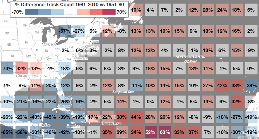
Although this is just one climate model, using this type of climate model in "ensemble simulation" mode where you run multiple versions of history, can potentially show up some trends in the data: or at least in the model's interpretation of history.
In this case, the climate model is pointing to potentially more activity out in the central Atlantic and towards the Caribbean, but decreases in activity towards Florida and parts of the Gulf.
If we go back to the historical data from the earlier chart it's interesting that we can split the recent warm spell into three "chunks" of quite varied activity:

...where 1995-2005 was busy, 2006-2016 went quieter and 2017-2020 was busy again. Now it's difficult to make any inferences from such short periods of data, but could it be that the sort of spell we had from 2006-2016 - with lower activity towards landfall - is a facet of modern hurricane seasons? The climate model example suggests this might be the case: but it's just one climate model.
However, we also must be cognizant that between 2005 and 2020 we've had two hyper-active hurricane seasons with 28 (2005) and 29 (as of mid-November 2020) storms.
This has led me to wonder what a future (or indeed even current) EP curve might look like:

An increase in multiple storm seasons - even though 2020 turned out fortuitously not to be hugely damaging - might push the tail of the curve out. With present-day (and future?) warmer seas, when we have multiple landfalling storms in these types of seasons, is the potential for big loss seasons greater now given that seas are warmer?
Conversely, if the climate model example and the evidence of the quiet landfalling phase of 2006-2016 suggests that seasons where storms stay out to sea more are becoming more frequent, might we expect the bottom end of the EP curve to be lower?
This is very much a load of "thinking out loud" here, but this is where the overlap between academia / national meteorological centres - with their large climate modelling supercomputers - and industry becomes ever more important. The former are continually developing ensemble climate simulations that might help us understand what present-day/future risk actually looks like.
Bonus Content: A Useful Seasonal Forecast?
One swallow doesn't make a summer, I realise, but a tip of the hat to the ECMWF seasonal forecast model earlier in the summer. I've been taking a look at the frequency of winds in their 51-member seasonal forecasts compared to a climatology from 1993-2016 to see whether they can spot the potential in the season.

The chart on the right is showing the 51 forecast from July for August to October versus the climatology from 600 forecasts from 1993-2016. It's highlighting where the frequency of wind gusts > 50 mph is higher or lower than the climatology. The main observation in this data is how the forecast pointed to elevated wind activity along the Gulf states.
I've not looked further into this - however this guidance turned out to be pretty useful given the plethora of storms that developed over or passed into the Gulf this season and maybe some hope that these sort of dynamical forecast could potentially give spatial rather than just broad quantitative guidance on tropical cyclone numbers.


Comments